Use of Quality Assurance Tools in Food Safety
Deploying data to probe root causes of safety lapses—and prevent them

When it comes to the use of quality tools, I have heard a general comment that they are more applicable to the chemical industry than to foods and beverages. I have been told that this idea comes from the beliefs “we are dealing with Mother Nature” and “we don’t have the resources,” among others. However, with the Food Safety Modernization Act, under corrective action procedures, food safety teams are required to provide written procedures that must describe the steps taken to identify and correct the problem, reduce the likelihood of occurrence, evaluate affected food for safety, and prevent affected food from entering commerce.1 Proper root-cause analysis tools may be useful to determine how to prevent recurrence and, most importantly, help identify the problem.
In general, it is true that there are difficulties when dealing with food, like having a hot summer and getting produce that is not up to specifications or trying to interpret certain microbiological results. I know that flow diagrams and control charts are commonly used. Here, I am sharing some quality assurance tools that can be used in the food industry,2 including some background and examples for better understanding and implementation. I have left out more complex tools such as x-R charts, statistical process control charts, and sampling, which can also be used but need separate data collection.
Data Measurements
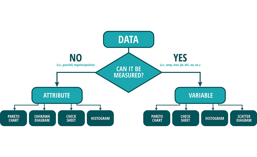
In the food industry, both product quality and food safety data can be considered as either attribute data or variable data. Attribute data are measurements that are counted—an individual item has or doesn’t have a specific characteristic. Variable data typically are physical, chemical, or biological measurements.
When using attribute data, we need to determine whether a product has or does not have a specific characteristic, let’s say: Salmonella positive or negative in a sample. Variable data typically are measured with units such as length, weight, temperature, pH, etc. Measurement data are variable data.
Figure 1 illustrates the type of chart that can be used depending on the type of data you collect: a Pareto chart using positive Listeria contamination points, Ishikawa diagram for a critical control point (CCP) deviation in a root-cause analysis, check sheets to organize data on a raw material Certificate of Analysis (CoA), histogram to help set up supplier specs, and even scatter diagrams to find the raw material correlation to finished goods results.
Figure 1: Different types of charts according to the type of data
Pareto Diagram or Pareto Chart
This diagram, named after Vilfredo Pareto—a 19th-century Italian economist—is commonly used as a tool to analyze root cause of failures or nonconforming items that can have multiple causal factors. The Pareto principle states that 80 percent of the problems come from 20 percent of the causes. In the Pareto chart, the problems are measured against the frequency of occurrence. It has multiple bars, with each bar representing a problem and arranged in a way that the most influential cause of the problem can be easily visualized.
Looking for quick answers on food safety topics?
Try Ask FSM, our new smart AI search tool.
Ask FSM →
How to build a Pareto diagram
This is an example to determine where contamination comes from.
- Identify the attribute you are evaluating (frequency of positive Listeria samples). This will be plotted on the left-hand side or vertical axis.
- List the locations where Listeria has been positive. Please note this is the most labor-intensive and complicated step. Going month by month, record by record, etc., collecting information is the most tedious but also the most critical part. This eventually will be plotted on the bottom or horizontal axis.
- Build a table listing the frequency of each location in descending order from the highest to the lowest. The hard work is now done, and numbers will speak for themselves:
- Calculate the frequency of each location as a percentage of the total frequency of complaints.
- Calculate the cumulative frequency in descending order. For the blender, the cumulative frequency is the same (35.3%), but after that, the cumulative frequency for the filter is the sum of the blender plus filter (35.3 + 23.5 = 58.8), and for the hopper is the sum of the cumulative plus hopper (58.8 + 11.8 = 70.6), etc.
- The frequency % for each location should be plotted on a chart, starting with the greatest frequency to show the magnitude of effect for the most critical location.
- A cumulative line may be drawn on the same chart, showing the effect of the most critical location (Figure 2)
2020 Micro Results: Listeria swabs
Figure 2: Pareto Diagram
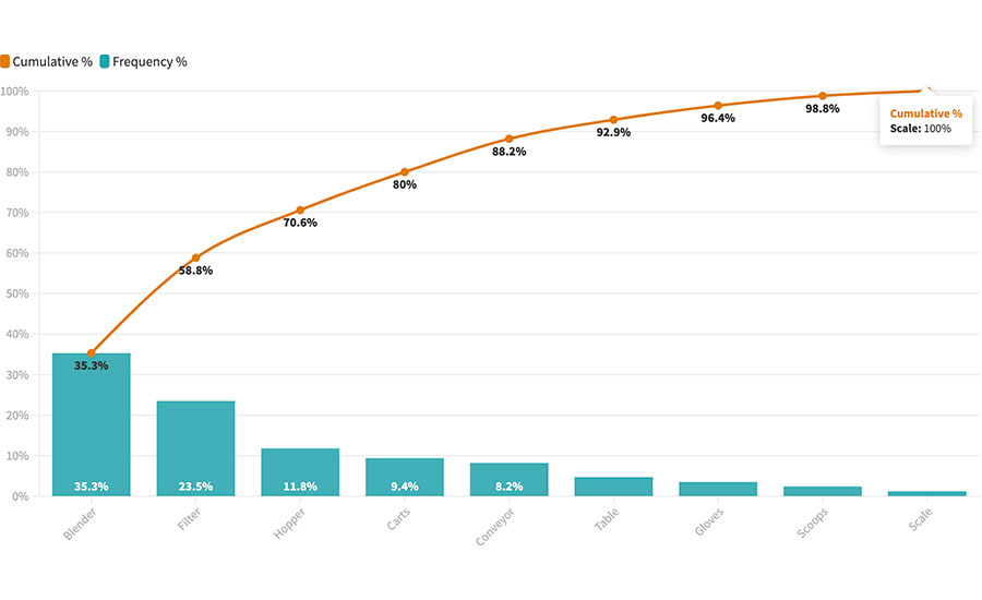
By dedicating immediate and efficient resources to improve the Sanitation Standard Operating Procedures of the blender, filter, and hopper, the result will be a 70 percent reduction of positive Listeria samples in this facility.
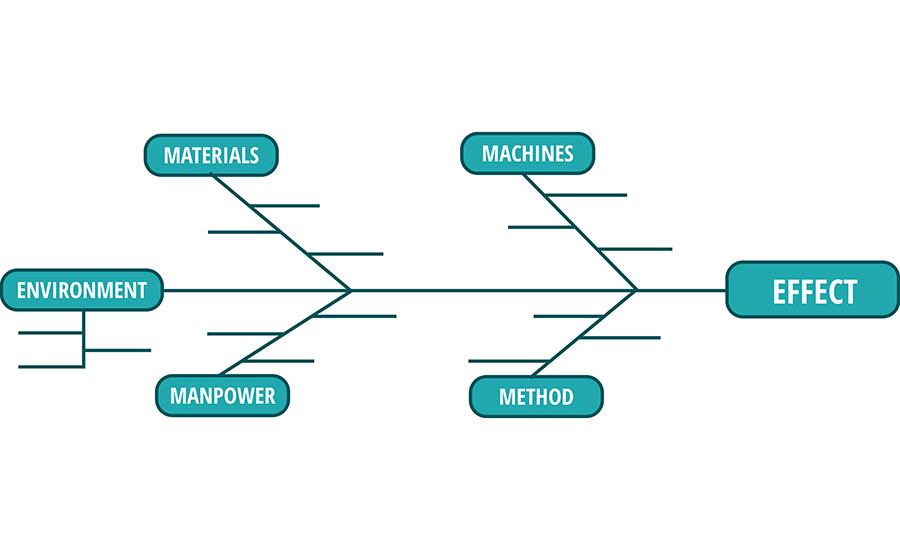
Cause-and-Effect Diagram: Fish Bone or Ishikawa Diagram
A cause-and-effect diagram is a simple way to help analyze a problem. It is also known as the “fish bone diagram” or Ishikawa diagram, which was developed by Kaoru Ishikawa, Ph.D., a professor of engineering at the University of Tokyo, who was noted for his quality management innovations. This diagram can be used as part of a root-cause problem-solving process to help identify, group, and analyze potential causes of a given problem.
How to use the Ishikawa diagram
This is an example to determine why the cooking CCP went below 180 degrees in an operation that requires frying temperature to be no lower than 180 degrees for food safety. These are the recommended steps.3
1. Gather a team that knows about the process and is concerned about the problem.
2. Write the description of the problem (i.e., the “Effect” in the diagram, Figure 3).
Figure 3: Ishikawa Diagram (empty)
3. List the potential causes on the fish bone (Figure 4). A very popular technique is to draw the diagram on a wall and have team members use Post-It notes to contribute to the list of potential causes.
Figure 4: Ishikawa Diagram (in process)
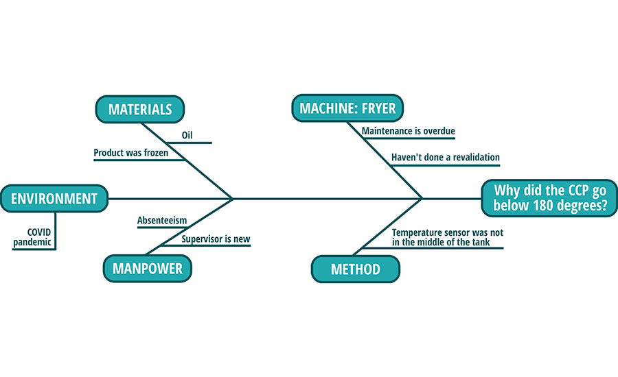
4. Any subfactors that could contribute to the major factor can also be added as sub-branches (Figure 5).
Figure 5: Ishikawa Diagram (completed)

5. After all factors have been added (it could take a couple of days until all members of the team have contributed), a brainstorming session of each branch and ideas would take place.
6. The frequency of all branches (causes) should be ranked according to the Pareto principle.
7. Implement the conclusions as part of the corrective action plan.
Check Sheets
Check sheets are records that make it easy to compile data so that they can be readily used in data analysis.1 They should be designed in the simplest possible way, so they are easy to understand and easy to fill out by the user/operator/tech. These can also help convert attribute data into variable data.
In this example, a company is making a root-cause analysis of finished product that is out of spec due to low citric acid content. A check sheet is created for the tech to report testing in 100 lots of citric acid that were sampled for potency.
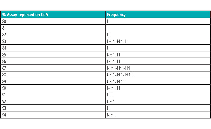
In this example, the operator/tech does not need to keep a separate file or folder; they can manually fill out this form as they are doing the day-to-day job.
Once the form has been completed, the numbers of affected lots are tallied and the information can be used for other analytical tools, like a histogram.
Histograms
It is unclear who the inventor of the histogram was, but William Playfair (1759–1823), a Scottish economist and inventor, is usually considered the first to use histograms. Karl Pearson is credited with openly introducing the use of histograms. Histograms are used to determine whether multiple distribution is occurring in a process; a histogram is a graphical display of tabulated frequencies that shows which proportion of cases fall into each of several categories.1
How to build a histogram
1. Using the previous example of citric acid, simply create a bar diagram with the frequency on the vertical axis and the attribute (% in this case) on the horizontal axis (Figure 6).4
Figure 6: Histogram
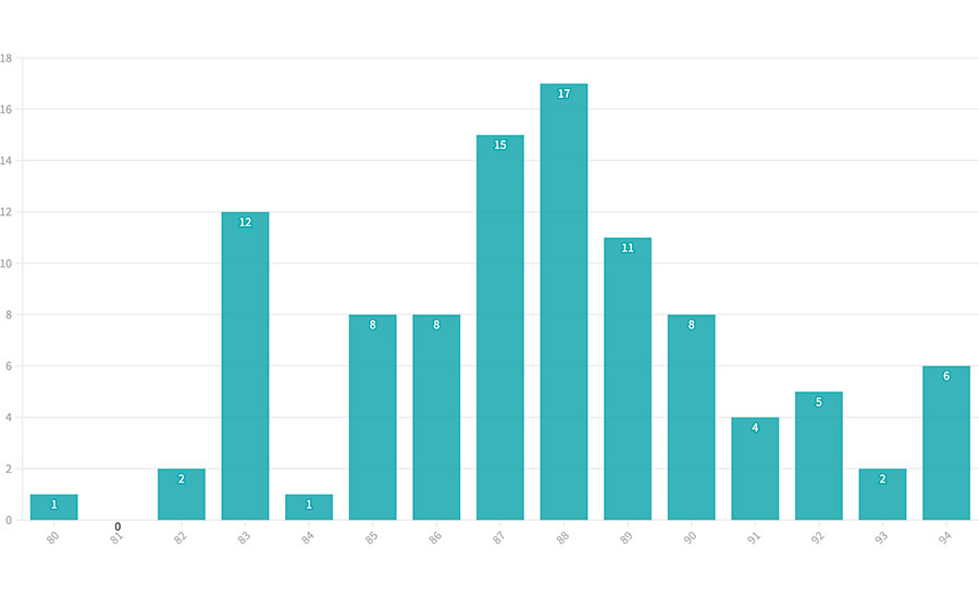
2. This histogram can be used to help set up a narrower specification range with the supplier since it’s easy to see they have a “normal” distribution, but they have some lots on both limits. They can definitely produce lots with an 85 to 90 percent assay that can be accepted and will help manufacture a consistent finished product.
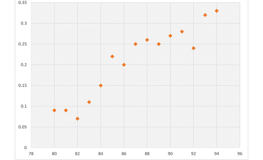
Scatter Diagrams
A scatter diagram or scatter plot is a graph used to display and compare two or more sets of related numerical data by displaying several data points.1 Staying with the previous citric acid example, a scatter diagram can be developed to correlate the citric acid lot with the finished product batch produced. These are helpful tools but are not commonly used to prove a cause-and-effect relationship (other problem-solving techniques such as an Ishikawa diagram are recommended to derive such proof).
How to build a scatter diagram
1. Collect pairs of data where you want to find a relationship or when a data correlation is suspected. In this case, lots with different assay results and the citric acid in the finished batches.
2. Draw a graph with the independent variable (citric acid % assay) on the horizontal axis and the dependent variable (finished product) on the vertical axis.
3. Look at the pattern of points to see if a relationship is obvious (Figure 7). If the data clearly form a line or a curve, you may stop because variables are correlated. In this case, the lower the % assay of the citric acid raw material, the lower the citric acid content in the finished product—the scatter diagram forms a curve. In such cases, you may wish to use regression or correlation analysis, which is one click away using Excel. But if the scatter diagram looks like the Milky Way, you can complete steps 4 through 7.
Figure 7: Scatter Diagram (with correlation)
4. In the next example, I have plotted the data in a way that does not clearly form a line or a curve. In this case, it’s necessary to divide points on the graph into four quadrants. There are 15 (x) points on the example graph. To divide the quadrants:
- Count x/2 points from top to bottom and draw a horizontal line.
- Count x/2 points from left to right and draw a vertical line.
- If the number of points is odd, draw the line through the middle point.
5. Count the points in each quadrant. Do not count points on a line (Figure 8).
Figure 8: Scatter Diagram (with no correlation)
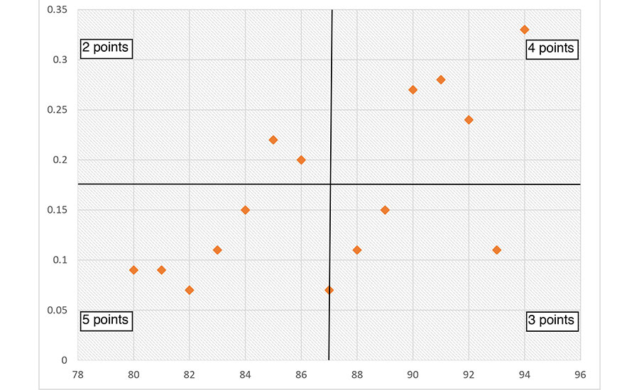
6. Add the diagonally opposite quadrants. Find the smaller sum and the total of points in all quadrants.
A = points in upper left + points in lower right
B = points in upper right + points in lower left
Q = the smaller of A and B
N = A + B
A 2 + 3 = 5
B 4 + 5 = 9
Q = 5
N 5 + 9 = 14
For N = 14, the limit is 2.
- If Q is less than the limit, the two variables are related. Since Q = 5 is greater than the limit 2, these two variables aren’t related.
- If Q is greater than or equal to the limit, the pattern could have occurred from random chance.
In summary, with a food safety perspective, we can obtain either attribute data or variable data such as Salmonella positive or negative in a sample (attribute) as well as data represented in units such as length, weight, temperature, pH, etc. (measurable). There are appropriate quality assurance tools that can be used in the food industry for either type of data, and analysis can be performed using these simple tools. Overall, they can contribute to the continuous improvement of the food safety plan.
7. Look up the limit for N on a trend test table.
References
- https://d1vy0qa05cdjr5.cloudfront.net/c6f30ca0-84ae-4613-bec0-5439702d4b9e/Instructor Resource Portal/FSPCA PC Course Participant Manual_V1.2_public.pdf.
- Surak, J.G. and S. Wilson, eds., The Certified HACCP Auditor Handbook (Milwaukee: ASQ Quality Press, 2014).
- Gould, W.A., Total Quality Management for the Food Industries (Glen Rock, NJ: CTI Publications, 1992).
- Hubbard, M.R., Statistical Quality Control for the Food Industry (New York: Springer, 2003).
Tatiana Miranda-Abaunza, MSc., holds a B.Sc. in food engineering and an M.Sc. in food science and is also a Preventive Controls-Qualified Individual Lead Instructor as well as a Certified Food Safety and Quality Auditor by ASQ. In her role of principal quality engineer at Nutrilite by Amway, she oversees the functional foods suppliers and has helped implement the Foreign Supplier Verification Program at the company.


